Welcome Visitor. First time here? Like what you see? Bookmark us for when you are bored, and check out 'top shots' and 'fantastic (editors choice)' in the menu above, you won't be dissapointed. Join our community!
click here to sign up for an account today. Sick of this message? Get rid of it by
logging-in here.


Very nice.
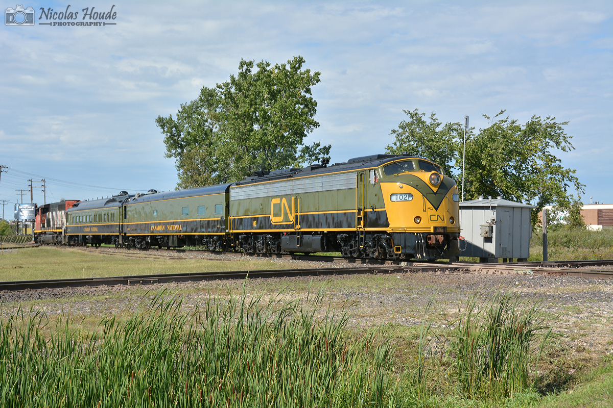
No one seems to like this paint scheme though
There are reasons why no one likes this scheme Steve…in my opinion it would look way better if they had followed the original paint scheme that inspired the current one on 102.
If they had done this it would be way better: http://www.rapidotrains.com/blog/wp-content/uploads/2013/08/2013-08-11D4.jpg
I think this photo deserves more favourites – but the paint scheme is holding this very nice photo back
Nice shot but I think that paint scheme is pathetic. A real upchuck special.